Google mobile: new index. What’s next?
11 November 2016 Leave a comment ALL-HANDS SEO
Mobile fuzzbuzz becomes louder every day. Google is the main character in this mobile play. The biggest search engine does everything to fire up the situation about it more. So the news about mobile index shouldn’t make experienced SEOs life harder, especially after they have survived after mobilegedon and AMP implementation.
In the beginning of 2015, Gary Illyes from Google made some points clear about mobile websites versions and their rankings.
- No ranking benefit for responsive. Google recommended responsive because it works well for Google, but webmasters don’t have to use only responsive for mobile, because other mobile site solutions work well too.
- Unblock CSS & javascript. Such blocked elements won’t let your website pass Google’s mobile-friendly test. A webmaster should allow Googlebot to crawl both CSS & javascript.
- Mobile friendliness should be considered for the whole website. Google bases mobile friendliness on a page by page case. In other words, if some pages of your website pass the test, it doesn’t mean your entire site passes the mentioned check.
- Google doesn’t need to see noscript if they can crawl javascript.
- Separate mobile index will soon be rolled out.
Illyes dropped a bit of a bombshell by saying that Google already has plans for the mobile index and the team is already working on it. Two years ago, he wasn’t sure what stage Google was at so has nothing to announce about it.
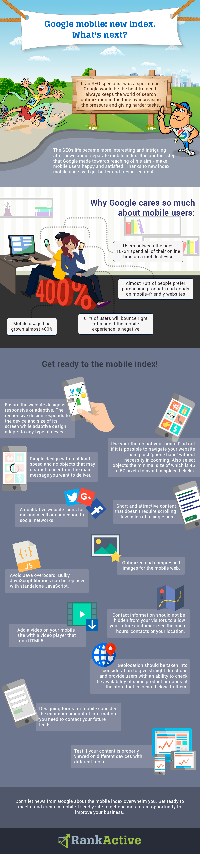
But everything has changed and now Google representatives confidently talk about separating the mobile index. Moreover, it will become a primary one for Google. It means that the desktop index will not be kept as up-to-date as new mobile index. Also, thanks to the new index the mobile users will have access to the fresher and better content. From another point of view, such news shouldn’t be shocking for SEOs and webmasters in light of what one of the biggest search engines has been rolling out for the last few years.
Here are some numbers that can explain why Google cares so much about mobile users:
- Mobile usage has grown almost 400%
- Users between the ages 18-34 spend all of their online time on a mobile device
- Almost 70% of people said they would prefer purchasing products and goods while they are visiting a website which is mobile-friendly
- 61% of users are ready to bounce right off a site in case mobile experience is negative
In light of what has been said above, modern business owners should not only have a well-optimized website, but it also should be a user-friendly, functioning properly on mobile devices and look good. In other words, you should be sure that when a user accesses your website from tablet or smartphone they will be 100% satisfied with it. This is important, because Googlebot sees your website just like any user does. So if a little crawler is happy with it your website will gain rankings, visitors and conversions.
Since it is still a big mystery how mobile index will work and what the main requirements to the websites will be, it is better to try fitting into them now to keep pace with the Google mobile surprise.
What do you need for making a website mobile-friendly
First of all, let’s clear up what website can be called “mobile-friendly”. It is a website that has been designed to be displayed and work on mobile devices. How such website should perform and what its main tasks are, we will try to figure out below.
1 Design can be responsive or adaptive. What is the difference between them?
- Responsive design means that a website has a design that responds to the device and size of its screen. The majority of new sites use responsive because it is easier to make one for less experienced designers and developers. Responsive doesn’t provide as much possibilities for control as adaptive. From another side, it takes less work to build and maintain it. Its layouts are fluid but when scaling still can cause a jump, for example, when a window is resized.
- Adaptive design is the creation of different website designs for every type of device. When users access a website, their devices are automatically detected and a website, in this case, is adjusted to provide the best option of displaying for users. Adaptive designs are more complex from the technical side, that’s why they are more expensive than responsive ones. Adaptive sites offer the optimal experience for each device with the optimal design for it.
There are a few ways to create any of the designs. You can build responsive or adaptive one:
- By yourself. For this, there is a necessity to have some knowledge about coding. You can apply the ones you have or attend courses to get a new skill.
- By purchasing a template. This option doesn’t require any coding skills and won’t take much time. You can buy a responsive template or use a website design platform. If you purchase a template, after the installation it will be ready-to-go.
- By hiring a developer. This option is the most expensive of all the options but it will give you the possibility to personalize your website the most. It can be a good freelance web developer or there may be an experienced specialist among your friends. Test out a freelancer with the simple job first so you are able to see if they follow instructions and can deliver the results you are willing to get.
Both designs are methods for viewing of websites on different devices in different contexts. And there are no certain criteria regarding which each of them should be used, because the decision is always up to a website owner.
2 Use your thumb. This method is very important for making your website navigable. For this, you need to find out if it is possible to navigate it using just one thumb. Put yourself on the side of users who use a mobile device. One of the most important tips for any mobile site is the ability to navigate it with ‘phone hand’ so a user’s second hand is free. So there shouldn’t be a necessity in zooming. Don’t forget to care about fat fingers. In such case, buttons and menu navigation must be big enough. It sometimes happens a mobile friendly website resizes the screen with CSS help not taking into account that big fingers might cause misplaced clicks.
The targets should be also easy to select. There is an average minimal size of the objects – 45 to 57 pixels. If you follow this simple rule, the targets will be easily selectable. Also, most of the accidental taps will be avoided.
3 Simple design. All websites owners should understand that an average user spends only a few seconds to understand if he is interested in what a certain company offers. This rule is more important for the mobile devices than for the desktop ones. Load speed of a website can be low because of heavy graphics, audio, video. Also, such elements may distract a user from the main message you want to deliver. If you use images on your website, choose small sizes to reduce the amount of time spent on loading a page.
4 Short and attractive content. Most of the mobile users prefer to read short informative content instead of scrolling few miles of a single post. Any story can be told in few words. Any smartphone display is smaller than a desktop of a computer that’s why the amount of text on your mobile website should be minimized because mobile users love to scroll quickly.
5 Qualitative website icons can be more informative than a random explanation. For example, to make a call or connect to social networks will be easier by clicking on an appropriate button. Plus, such symbols help to optimize a website for mobile devices.
6 Optimize images for the mobile web. Make sure that your media files from the desktop site are compressed. It should be taken into consideration, that most of the mobile devices are operated under a 3G network which has an impact on download speeds. It is another reason why all the images should be resized, cropped and optimized to the specific device resolution.
7 Avoid Java overboard. Excessive JavaScript added to the mobile websites runs differently on different browsers and devices. It doesn’t mean you must stop using JavaScript. Bulky JavaScript libraries are better to replace with standalone JavaScript.
8 Contact information. Phone number, location and any other contact info should not be hidden from your visitors. It is an important part of the website, especially, if your future customers look for open hours, contacts or your location. Make it easy for users to access such information and get better user’s experience.
9 Add a video on your mobile site. According to statistics, consumers use mobile devices to watch videos more than a laptop or a desktop computer. For this you will need to use a video player that runs HTML5 to be sure that a video will be played on most mobile devices. Also, choose a video player that doesn’t consume valuable bandwidth and processing resources.
10 Design forms for mobile. Consider requesting the minimum amount of information you need to contact your future leads. Number and size of forms must be minimized for optimizing mobile devices usability.
11Geolocation should be taken into consideration. Why do you need it? The thing is that most of businesses use geolocation to give straight directions and provide users with an ability to check availability of some product or goods at the store that is located close to them.
12Ensure that your content is properly viewed on different devices. It is needed to improve the mobile user experience. If you know the type of mobile device and its operating system you will be able to test the usability of your website with different tools. Such information can be found at the Google Analytics account so you can consider it and apply changes to your website according to the received data.
Conclusion
When such overwhelming news from Google as the mobile index launching appear on the Web, everyone can feel that huge strain in the air. But instead of taking part in “what are we gonna do and how will we survive” hysteria, it is better to get ready to meet the new updates prepared to it and armed at all points. As for the mobile index, no one can be 100% sure what it will bring and how the SEO world will change after it, but it is possible to predict some changes and get ready for them. Look at your website from mobile users side, optimize it for them, make it fast and informative to provide the best user experience. The main rule is to see the task of creating a mobile-friendly site not as a challenge but like an opportunity to improve your business.
Tags:
Like this article? There’s more where that came from.
- YouTube Hacks Your Online Marketing Agency Can Implement to Boost Video Rankings
- When Less is More: Why We Decided to Remove Backlinks and Link Manager Features
- How to increase your CTR using Schema.org
- How to Get Out of Google Sandbox and Do It Quickly?
- Geolocation Redirect 101: How to Secure Your SEO Localization Efforts?
- Your Ultimate Guide to SEO Reporting with RankActive
- Your 7-Step Guide to Increasing Page Speed
- How to Do SEO Competitor Analysis? Your Checklist for 2019