Is your website mobile-friendly? Tools to analyze
15 September 2016 Leave a comment ON-PAGE SEO
Everyone cares about SEO nowadays. And it is almost impossible to find a person that doesn’t know how important it is to build and promote a website for business. For the last few weeks, there are more and more talks about “mobile-friendliness” of websites. Why it became so important and how to find out if your website is a friend for users’ mobile devices – we will try to figure out together.
What is mobile friendliness?
A few years ago it was enough to have a SEO optimized website to fight for the top positions in the SERPs. But Google loves to challenge everyone and doesn’t let the internet community be bored. That’s why Big G always rolls up and surprises with the news. One of them exploded the internet community. Google announced its intention to pay the closest attention to the fact if a website is mobile-friendly.
I can bet that at least once in your life you’ve tapped on a Google Search result when tried to search from your mobile phone, and saw the page where the text was too small or links were a bit tiny. There was definitely a need to scroll sideways to read the whole text. Such things still happen if a website is not optimized for a mobile device. Google considers this experience as the frustrating one for those who search using a mobile device.
In 2014 it gave few tips on how a website shouldn’t look like. There are criteria that Googlebot checks when scans your website. So what it doesn’t like:
- Software that is uncommon for mobile devices, for instance, Flash
- Text that can’t be read without zooming
- Size of the content that makes a user scroll horizontally
- Links that can’t be easily tapped
When one of the biggest search engines in the world rolled up an update in 2015, it said that it would affect search rankings on mobile devices, search results in all languages, and be applied to individual pages, not websites in a whole.
To check if your website is mobile-friendly you can use different tools but not all of them give really useful information. We’ve tested many of them to pick the best, in our opinion, for you.
Tools to test if your website is mobile-friendly
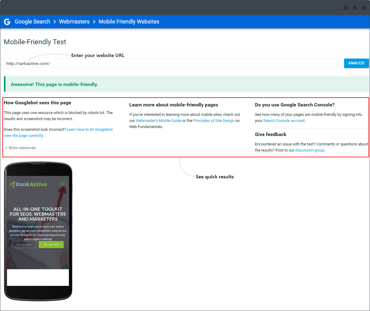
Of course, first in this list must be Mobile-Friendly Test from Google, but since the information that a user receives after is pretty short and common, let me just leave it here for those who love quick solutions.
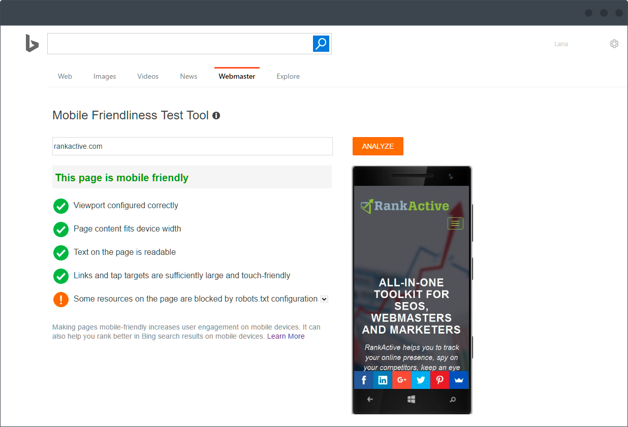
Also, Bing followed Google’s example and created its own Mobile Friendliness Test Tool where you can check the mentioned parameter for this search engine and see how your website looks like on mobile devices. As you can see it doesn’t dig that deep but still provides a user with the necessary information about what tests were passed and which ones were not. If you click “Learn More” lower on the page there will be an explanation of how to make your website friendly for mobile devices, some tips and valuable pieces of advice from Bing.
If you are into detailed analysis, then let’s move to the tools for big boys and girls.
PageSpeed Insights
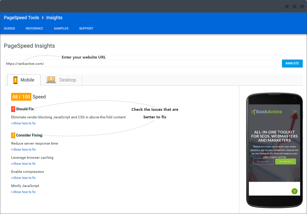
Google’s tool PageSpeed Insights lets you test most of the parameters that are considered when Googlebot scans a website’s page.
As you can see, after checking the tool shows you possible errors that may make your website not friendly for mobile devices. When you click on the certain issue, you will see the tip about how you can eliminate the problem which is very useful because there is no need to search manually or use other tools to detect the exact problem PageSpeed Insight has found.
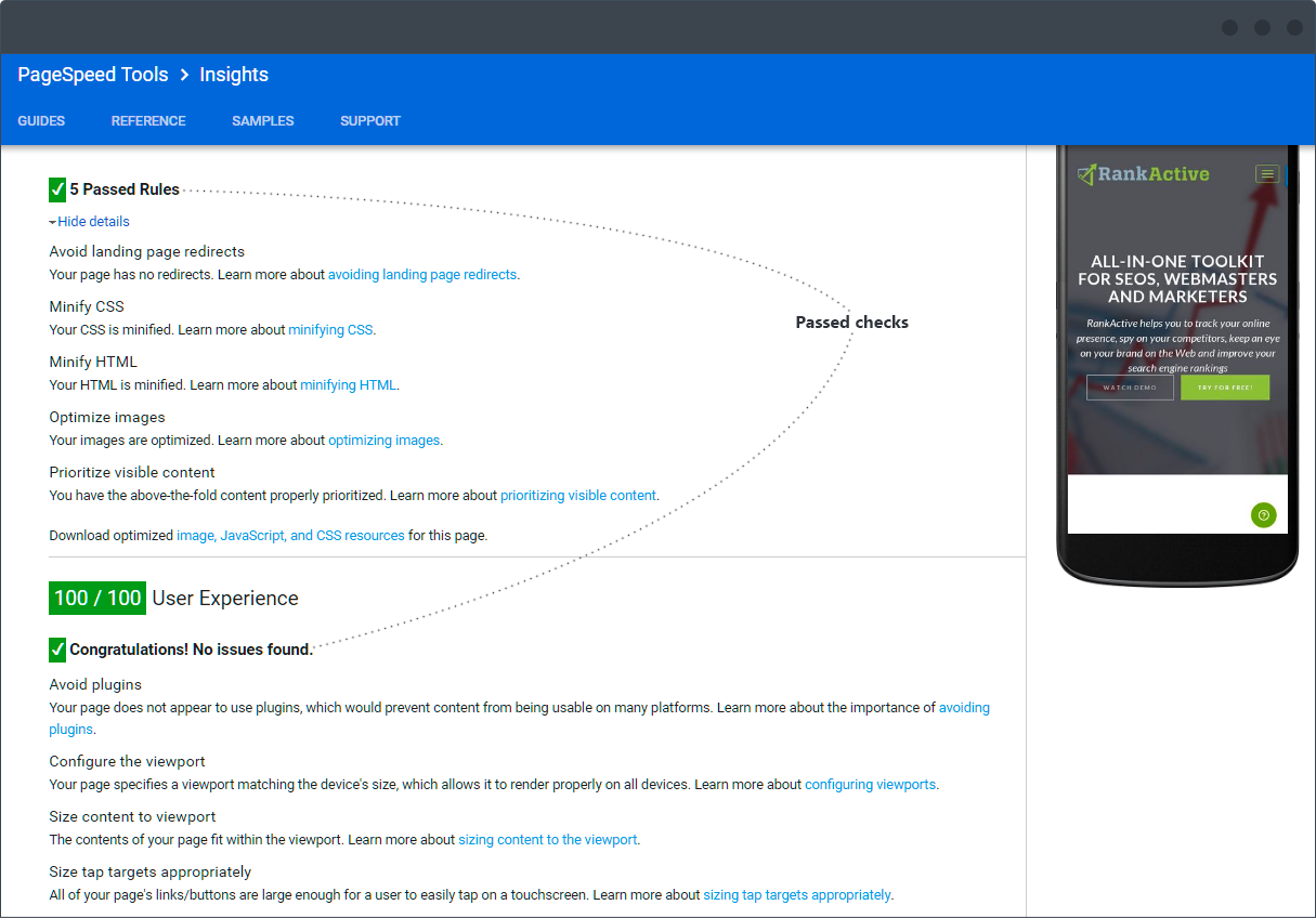
And if you scroll down, you will be able to see what checks the page passed with the explanation of what the certain parameter means.
The PageSpeed Insights tool, like any other tool as well, doesn’t provide a user with the whole amount of the information that is important for making a website mobile-friendly. So it is better to use other tools to estimate all possible issues that can be on the way to success.
Mobile SEO
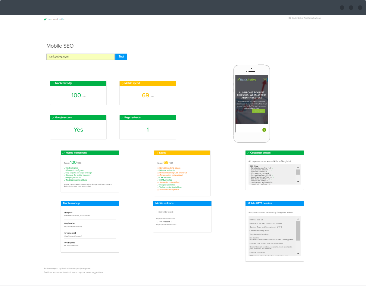
Mobile SEO tool not only tests the friendliness parameter but also gives tips on what parameters it is better to improve for getting the better score if it is bad. To analyse mobile-friendliness of a page it will take up to 45 seconds. After this, you will see a list of checkups and problems that influence mobile-friendliness in a bad way. Here you can find out mobile friendliness and speed, check Google access, page redirects, mobile makeup, redirects and HTTP headers. Also, below the checkups, you can find a guide. It contains different pieces of advice on how to improve parameters that have the straight influence on mobile rankings.
mobiReady
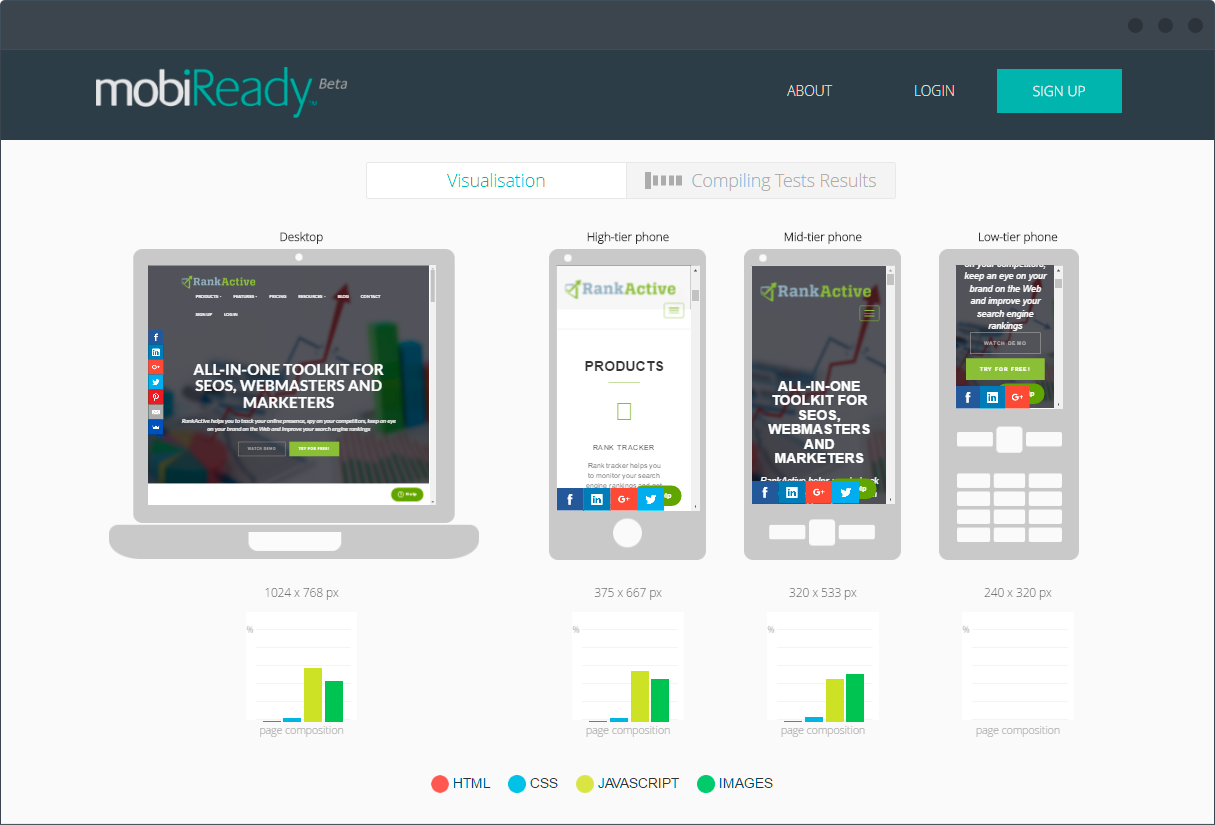
The mobiReady tool is actually one of the winners of the mobile-friendliness race. When you add the URL for analysing the system will not show you results for one common device that is considered as a standard. It will provide you with the information and show how the website is shown on devices with different specifications. You can find out what device your audience uses for viewing the website at Google Analytics and then make sure the site is optimized according to their needs.
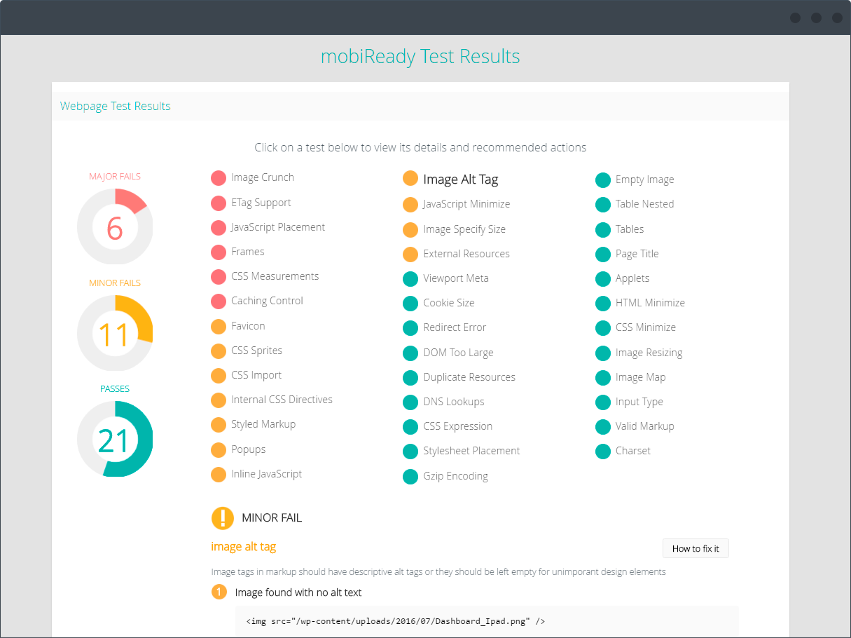
After you have checked the overall information, scroll down to see the details. By clicking each of the parameters you will get the short but very informative tip about what it means. If it is red – there’s definitely a problem that should be immediately fixed. For instance, JavaScript placement. The service recommends to always embed JavaScript includes at the end of the document to avoid blocking the page loading. As for yellow colored fails they are not critical but are considered as important ones as well. Another tool’s hint is combining CSS image assets into sprite files, thanks to this expensive HTTP overhead will be avoided. Green color means that the test has been passed. For example, in the case of our website, Cookie Size checkup was passed successfully, as total cookie size should not exceed 1kb, session cookies can help to eliminate excessive cookie data. All the errors and fails also have the explanation on how to fix them. As for passes, next to the short info block there is the More Info button.
There are common mistakes that webmasters face when trying to make their websites mobile-friendly. Let’s take a look at them.
JavaScript, images, CSS
If you want to get optimal rendering and indexing, don’t disallow an access for Googlebot to the JavaScript, CSS, and images. Please remember that this little bot can see your website like an average user and even better.
How to fix
Make sure there is an access to it in your site’s robots.txt file for crawling of assets mentioned above. In another case, your rankings can be directly harmed. Google recommends making sure that JavaScript, images, and CSS are crawlable for Googlebot. You can allow the action with “Fetch as Google” feature in Google Search Console. It will show you how the bot sees and renders the content of your website. Also, you will be able to find out what indexing issues your site has. There, at the console, you can check and test robots.txt. If there are separate URLs for mobile pages, make sure you’ve tested both the mobile and the desktop URLs.
The content that can’t be played on mobile devices
Sometimes a website has videos and content that are not playable on mobile devices. They usually require Flash and other players not supported on mentioned type of devices. In the end, such content will only frustrate your users by showing an error instead of what they came for to your website.
How to fix it
Google recommends using HTML5 standard tags for including videos or animations. For animated content which displaying demands Flash or other multimedia players, specialists advise using HTML5 animations that work across all web browsers. There is even a tool that will help you to implement your ideas, with Google Web Designer it is easy to make any animations in HTML5. Also, it is better to use video-embedding. It will make the special content be playable on all devices. There should be the transcript of the video that is published on the website. Your site will become accessible to those people who use assistive browsing technologies. Also, it will be helpful to those who have browsers without the possibility to play a video format.
Faulty redirects
This issue can occur when there are separate mobile URLs. In this case, mobile users are usually redirected from each desktop URL to the appropriate mobile URL. The redirection process can often be incorrect.
How to fix it
First of all, use Google Search Console. A verified user will get a message if there is any site’s page that redirects smartphone users to the homepage or any faulty redirects are present on a site. The last ones can be found at the Smartphone Crawl Errors section in Search Console.
Another advice is to set up a server so it redirects smartphone users to the equivalent URL on your mobile version of a site.
In the case when a page doesn’t have a mobile match, users should be kept on the desktop page instead of being redirected to the mobile site’s homepage. In this case doing nothing is better than wrong actions.
Try to use responsive web design, which serves the same content for desktop and smartphone users.
Mobile-Only 404s
It often happens when users can access sites from the desktop but the same URL is shown as an error page to users who use mobile devices. If you want to get the best score for user experience, you should check if all of your desktop pages redirect to equivalent mobile ones. Please note that the mobile-friendly page can also be an error page itself.
How to fix it
Verified Google Search Console users get a notification in case such issue occurs. If there is Dynamic serving usage, a webmaster should ensure that the user-agent detection is configured in the right way. Another way to detect and fix the issue is to check the Crawl Errors report in Google Search Console. If a problem happens at the Smartphone tab there will be a list of detected URLs with smartphone-only 404 errors.
Promotion
Many websites often use interstitials or overlays which can completely cover the content of the page when a user visits it. As usual, it is a promotion of a website’s native app, also it can be some mailing subscription forms or simple advertisements. If it is impossible to close them, in the end, a website has the low score of user experience.
How to fix it
As a solution to such issue, a simple banner for the promotion of your app that is placed inline with the page’s content can be used. For such kind of banner, you can use different browser-supported banners provided by Smart App Banners or Native App Banners for Safari and Chrome respectively.
Too close placement of touch elements
Touch elements (buttons and links) should not be set close to each other. A mobile user must be able to easily tap the desired element without tapping a neighboring element. To avoid this kind of errors, ensure that the buttons and links are placed suitably for mobile visitors.
Conclusion
Since the number of users who search and visit websites from their mobile devices is growing every single moment, it is highly important to sink teeth into your website optimization to deliver the mobile-friendly version of it. Using tools that help to analyse the mentioned parameter and in time fixing of all the errors that can harm it will help you to get the best mobile user experience, high rankings, and conversions rate.
Tags:
Like this article? There’s more where that came from.
- YouTube Hacks Your Online Marketing Agency Can Implement to Boost Video Rankings
- When Less is More: Why We Decided to Remove Backlinks and Link Manager Features
- How to increase your CTR using Schema.org
- How to Get Out of Google Sandbox and Do It Quickly?
- Geolocation Redirect 101: How to Secure Your SEO Localization Efforts?
- Your Ultimate Guide to SEO Reporting with RankActive
- Your 7-Step Guide to Increasing Page Speed
- How to Do SEO Competitor Analysis? Your Checklist for 2019

